This post outlines the steps to download Google's stock price data and create a candlestick chart using Python, matplotlib, and the yahooquery library. We will illustrate how to plot the basic candlestick chart, add 5-day and 20-day moving averages, and utilize built-in styles provided by mplfinance. If you're unfamiliar with how to use the yahooquery library, please refer to the previous post [Python] Yahooquery: Retrieving and Managing Past Stock and Financial Data.
Obtaining Google's Stock Price Data
The code snippet to fetch Google's stock price data for the last 60 days is as follows:
from yahooquery import Ticker

google = Ticker('GOOGL')
price_data = google.history(period='60d')
Preparing the Data
Next, manipulate the data as follows:
import pandas as pd

price_data.reset_index(inplace=True)
price_data['date'] = pd.to_datetime(price_data['date'])
price_data.set_index('date', inplace=True)
Plotting the Candlestick Chart
Basic Candlestick Chart
import mplfinance as mpf

mc = mpf.make_marketcolors(up='g',down='r')
s  = mpf.make_mpf_style(marketcolors=mc)

mpf.plot(price_data,
         style=s,
         type='candle',
         volume=True,
         tight_layout=True)
Here's the resulting image:
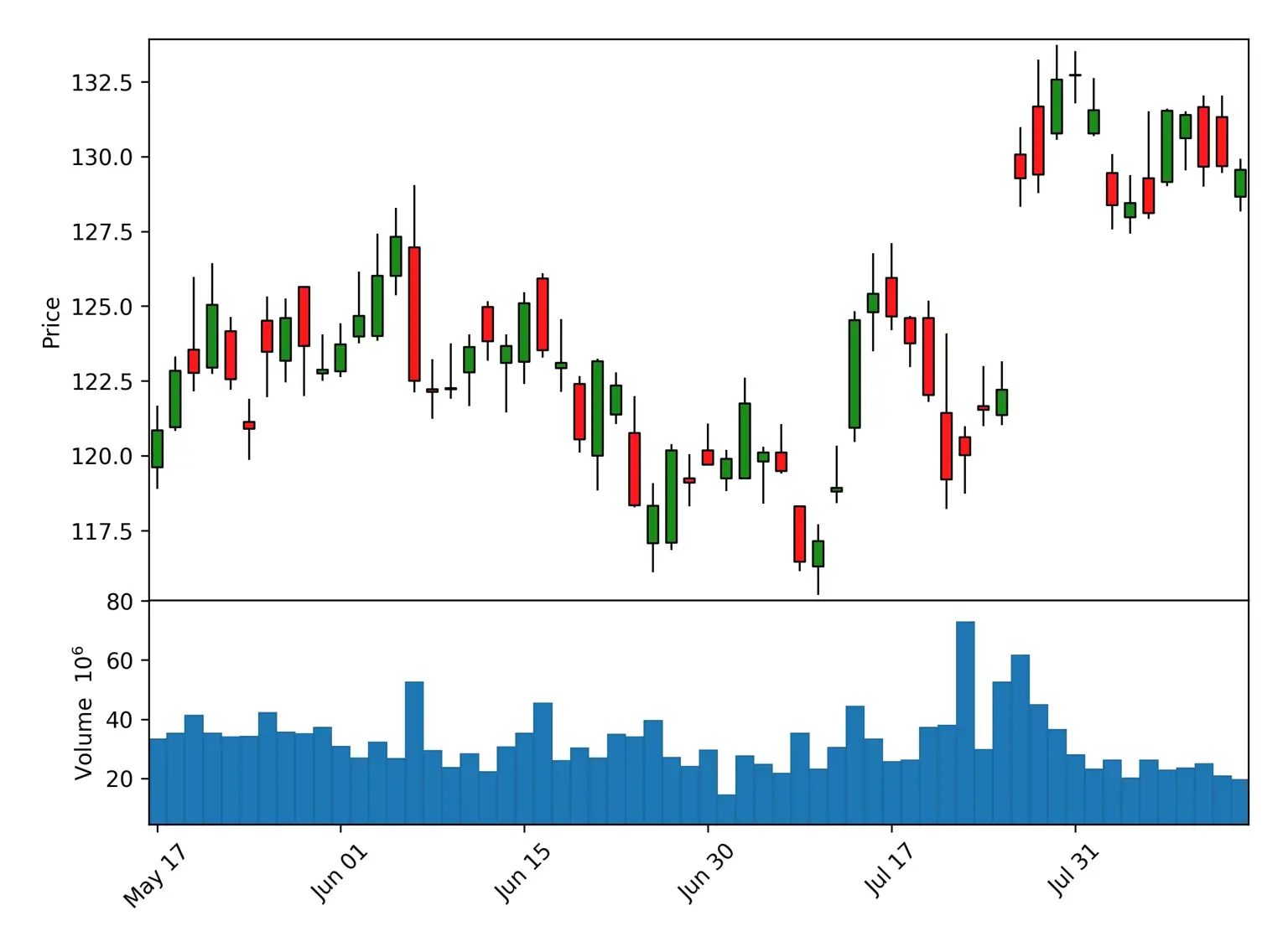
This chart shows the basic candlestick chart without moving averages.
Adding 5-day and 20-day Moving Averages
mpf.plot(price_data,
         style=s,
         type='candle',
         mav=(5, 20),
         volume=True,
         tight_layout=True)
Here's the image:
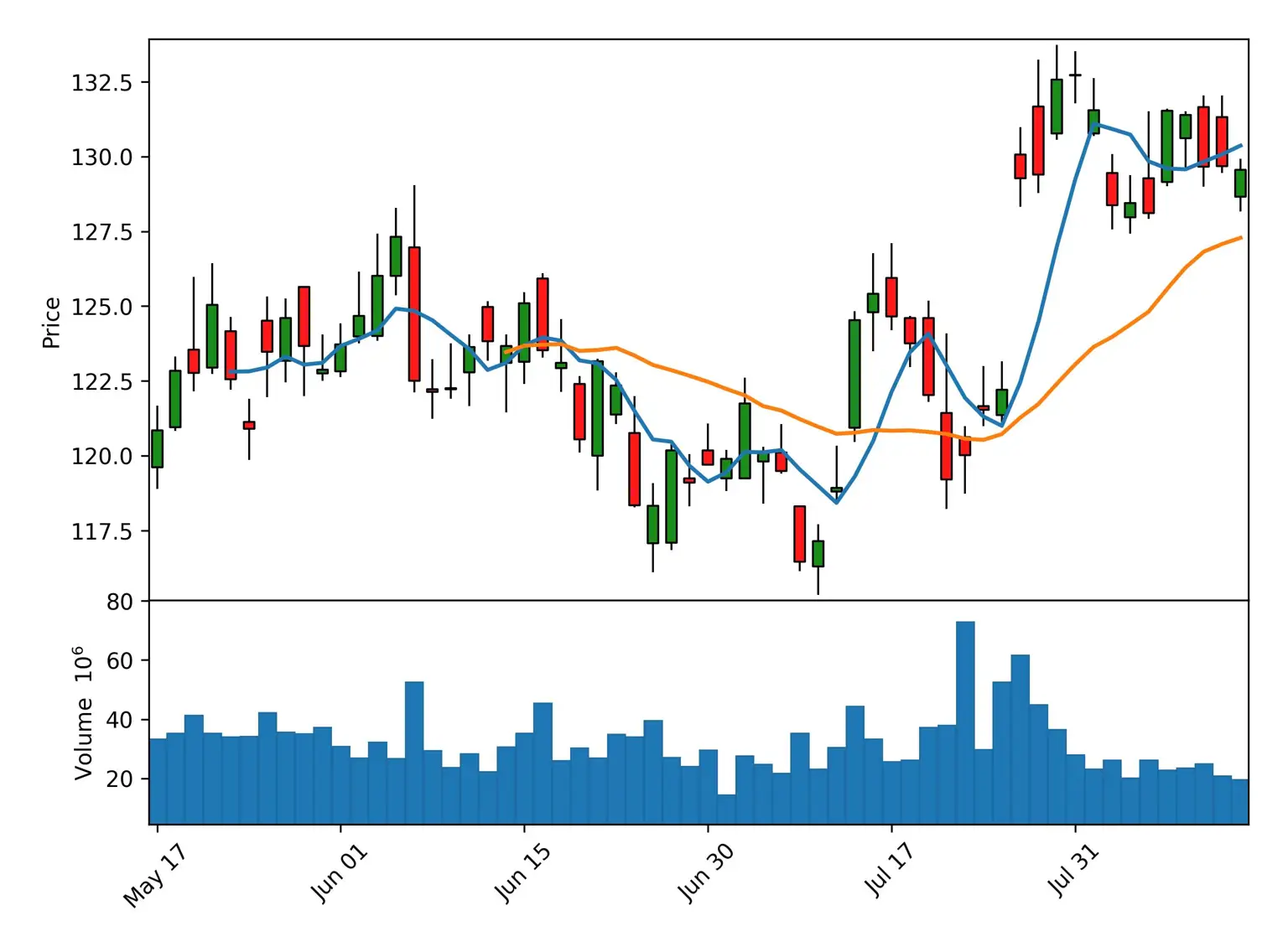
This chart includes the 5-day and 20-day moving averages, enhancing the trend analysis.
Utilizing Built-in mplfinance Styles
mplfinance comes with several built-in styles that you can use without creating a custom style. Instead of defining market colors as we did with:
mc = mpf.make_marketcolors(up='g',down='r')
s  = mpf.make_mpf_style(marketcolors=mc)
You can use one of the following built-in styles:
['binance', 'blueskies', 'brasil', 'charles', 'checkers', 'classic', 'default', 'ibd', 'kenan', 'mike', 'nightclouds', 'sas', 'starsandstripes', 'yahoo']
For example, to use the Yahoo Finance-like style:
mpf.plot(price_data,
         style='yahoo',
         type='candle',
         mav=(5, 20),
         volume=True,
         tight_layout=True)
Here's the resulting image with Yahoo Finance-like style:

This approach simplifies the customization process by utilizing predefined styles that suit different preferences.
This post has demonstrated how to visualize Google's stock price data using a candlestick chart. By employing the mplfinance library, it's possible to create detailed visualizations, adding features like moving averages and utilizing the library's built-in styles. This method can serve as a powerful tool for financial analysis and market trend observation.
FAQs
What is the yahooquery library, and how do I use it? Refer to the previous post [Python] Yahooquery: Retrieving and Managing Past Stock and Financial Data.
Can I plot the candlestick chart for a different stock? Replace 'GOOGL' with the desired stock symbol.
How can I customize the colors of the candlestick chart? Modify the parameters in the
make_marketcolorsfunction.Can I change the time period for which the data is fetched? Replace
60dwith the desired time period.What is a candlestick chart, and why is it used? A candlestick chart is a graphical representation of price movements, widely used in financial analysis.