
[Python] Drawing Candlestick Charts with mplfinance
- CloneCoding
- Language / Python
- August 12, 2023
This post outlines the steps to download Google's stock price data and create a candlestick chart using Python, matplotlib, and the yahooquery library. We will illustrate how to plot the basic candlestick chart, add 5-day and 20-day moving averages, and utilize built-in styles provided by mplfinance. If you're unfamiliar with how to use the yahooquery library, please refer to the previous post [Python] Yahooquery: Retrieving and Managing Past Stock and Financial Data.
Obtaining Google's Stock Price Data
The code snippet to fetch Google's stock price data for the last 60 days is as follows:
from yahooquery import Ticker

google = Ticker('GOOGL')
price_data = google.history(period='60d')
Preparing the Data
Next, manipulate the data as follows:
import pandas as pd

price_data.reset_index(inplace=True)
price_data['date'] = pd.to_datetime(price_data['date'])
price_data.set_index('date', inplace=True)
Plotting the Candlestick Chart
Basic Candlestick Chart
import mplfinance as mpf

mc = mpf.make_marketcolors(up='g',down='r')
s  = mpf.make_mpf_style(marketcolors=mc)

mpf.plot(price_data,
         style=s,
         type='candle',
         volume=True,
         tight_layout=True)
Here's the resulting image:
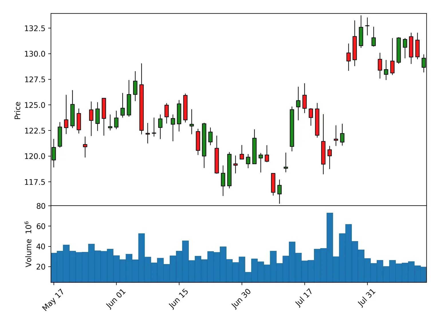
This chart shows the basic candlestick chart without moving averages.
Adding 5-day and 20-day Moving Averages
mpf.plot(price_data,
         style=s,
         type='candle',
         mav=(5, 20),
         volume=True,
         tight_layout=True)
Here's the image:
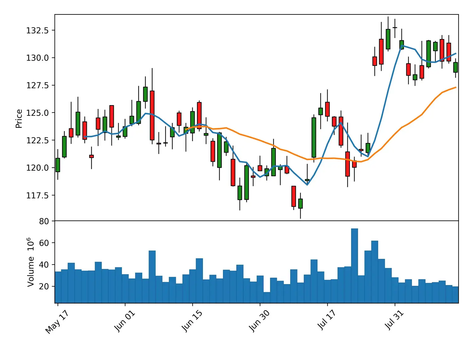
This chart includes the 5-day and 20-day moving averages, enhancing the trend analysis.
Utilizing Built-in mplfinance Styles
mplfinance comes with several built-in styles that you can use without creating a custom style. Instead of defining market colors as we did with:
mc = mpf.make_marketcolors(up='g',down='r')
s  = mpf.make_mpf_style(marketcolors=mc)
You can use one of the following built-in styles:
['binance', 'blueskies', 'brasil', 'charles', 'checkers', 'classic', 'default', 'ibd', 'kenan', 'mike', 'nightclouds', 'sas', 'starsandstripes', 'yahoo']For example, to use the Yahoo Finance-like style:
mpf.plot(price_data,
         style='yahoo',
         type='candle',
         mav=(5, 20),
         volume=True,
         tight_layout=True)
Here's the resulting image with Yahoo Finance-like style:
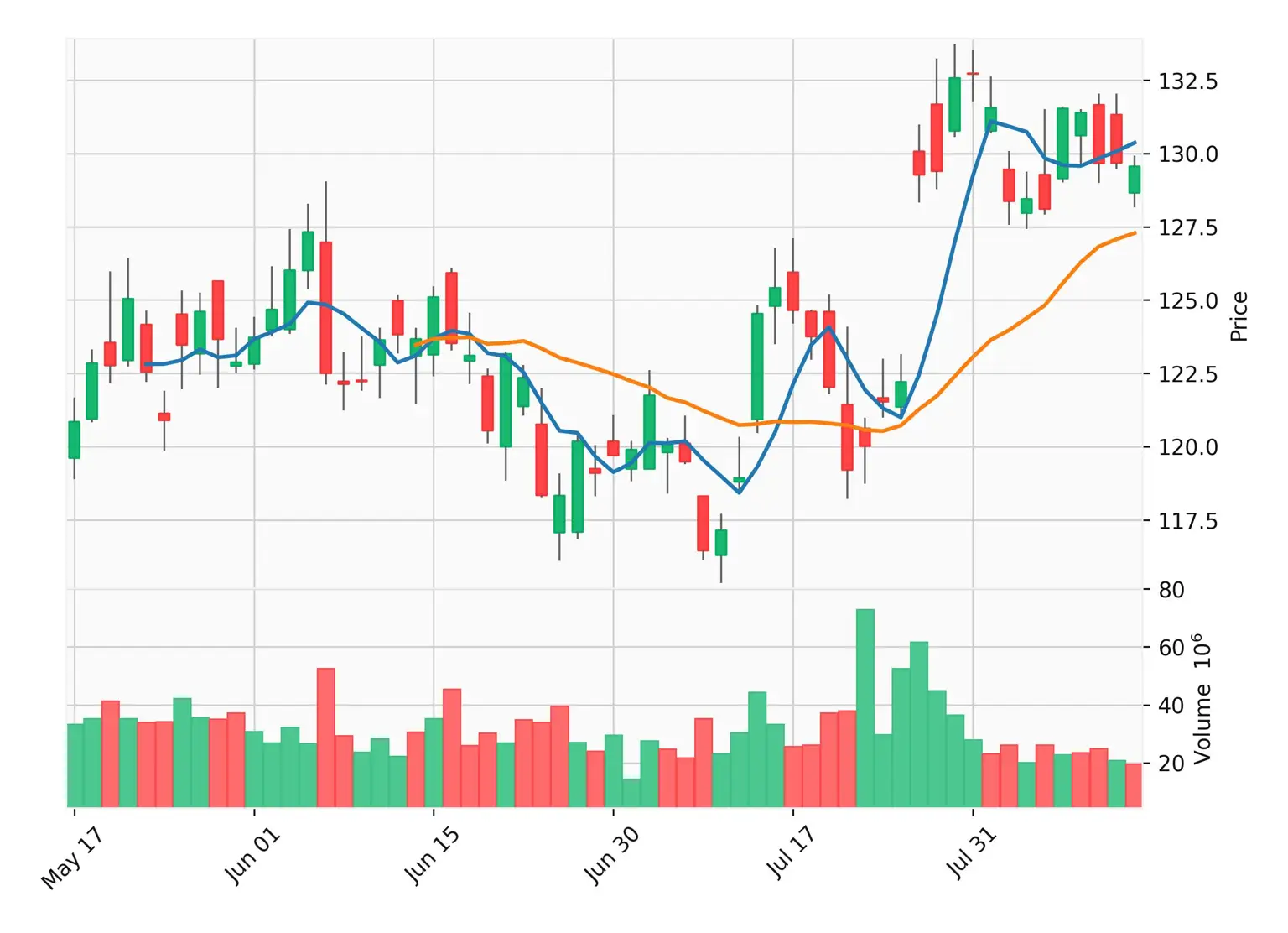
This approach simplifies the customization process by utilizing predefined styles that suit different preferences.
This post has demonstrated how to visualize Google's stock price data using a candlestick chart. By employing the mplfinance library, it's possible to create detailed visualizations, adding features like moving averages and utilizing the library's built-in styles. This method can serve as a powerful tool for financial analysis and market trend observation.
FAQs
- What is the yahooquery library, and how do I use it? Refer to the previous post [Python] Yahooquery: Retrieving and Managing Past Stock and Financial Data.
- Can I plot the candlestick chart for a different stock? Replace 'GOOGL' with the desired stock symbol.
- How can I customize the colors of the candlestick chart?
Modify the parameters in the
make_marketcolorsfunction. - Can I change the time period for which the data is fetched?
Replace
60dwith the desired time period. - What is a candlestick chart, and why is it used? A candlestick chart is a graphical representation of price movements, widely used in financial analysis.
Other Posts in the Language / Python
CloneCoding
Innovation Starts with a Single Line of Code!
Categories
- Language(47)
- Web(19)
- Searies(7)
- Tips & Tutorial(4)
Recent Posts
![[JavaScript] Downloading Screenshots using html2canvas]() Learn how to download webpage screenshots using the html2canvas library. Dive into its features, advantages, installation, usage, and things to watch out for.
Learn how to download webpage screenshots using the html2canvas library. Dive into its features, advantages, installation, usage, and things to watch out for.![[CSS] Dark Mode Guide: System & User-Based CSS Implementation]() Explore methods to implement dark mode on your webpage. Understand how to use system settings and user choices for effective dark mode transitions.
Explore methods to implement dark mode on your webpage. Understand how to use system settings and user choices for effective dark mode transitions.![[Next.js] When to Use SSR, SSG, and CSR - Ideal Use Cases Explored]() In Next.js, we detail which rendering method, be it SSR, SSG, or CSR, is best suited for different site categories.
In Next.js, we detail which rendering method, be it SSR, SSG, or CSR, is best suited for different site categories.![[CSS] Pseudo Selector Guide - Essential Styling Techniques]() An in-depth look into CSS pseudo selectors. Learn about :first-child, :last-child, :nth-child(n) and more. Discover practical application scenarios.
An in-depth look into CSS pseudo selectors. Learn about :first-child, :last-child, :nth-child(n) and more. Discover practical application scenarios.![[Next.js] SSR vs. CSR vs. SSG: Understanding Web Rendering Techniques]() A deep dive into the three rendering methods in Next.js: Server Side Rendering (SSR), Client Side Rendering (CSR), and Static Site Generation (SSG), exploring their workings, benefits, and drawbacks.
A deep dive into the three rendering methods in Next.js: Server Side Rendering (SSR), Client Side Rendering (CSR), and Static Site Generation (SSG), exploring their workings, benefits, and drawbacks.
![[JavaScript] Downloading Screenshots using html2canvas](https://img.clonecoding.com/thumb/101/16x9/320/javascript-downloading-screenshots-using-html2canvas.webp)
![[CSS] Dark Mode Guide: System & User-Based CSS Implementation](https://img.clonecoding.com/thumb/100/16x9/320/css-dark-mode-guide-system-user-based-css-implementation.webp)
![[Next.js] When to Use SSR, SSG, and CSR - Ideal Use Cases Explored](https://img.clonecoding.com/thumb/99/16x9/320/next-js-when-to-use-ssr-ssg-and-csr-ideal-use-cases-explored.webp)
![[CSS] Pseudo Selector Guide - Essential Styling Techniques](https://img.clonecoding.com/thumb/98/16x9/320/css-pseudo-selector-guide-essential-styling-techniques.webp)
![[Next.js] SSR vs. CSR vs. SSG: Understanding Web Rendering Techniques](https://img.clonecoding.com/thumb/97/16x9/320/next-js-ssr-vs-csr-vs-ssg-understanding-web-rendering-techniques.webp)