In this post, we focus on the process of graphing for stock market trend analysis. This procedure consists of five parts: initial configuration, data preparation, chart outline creation, main chart rendering, drawing MACD indicators and MACD oscillator histograms, chart titles, legends, tick setting, and chart output.
Initial Configuration and Data Preparation
We import the necessary libraries and modules to draw the chart, and prepare the data for the desired stock. We use yahooquery to fetch stock price data from Yahoo Finance, encompassing opening price, closing price, highest price, and lowest price for a specific period. These data points are essential components for chart creation.
Code
from yahooquery import Ticker
import pandas as pd

# Number of data to be displayed
show_count = 250
# Number of ticks to be displayed on the x-axis
tick_count = 10

# Downloading Google's stock data from yahooquery
goog = Ticker('GOOG')
data = goog.history(period="2y")
# Resetting the index for 'symbol' and 'date' and setting a new index with the 'date' column
data.reset_index(inplace=True)
data['date'] = pd.to_datetime(data['date'])
data.set_index('date', inplace=True)

# Calculating moving averages using the talib library
data["sma5"] = talib.SMA(data.close, timeperiod=5)  # 5-day moving average
data["sma20"] = talib.SMA(data.close, timeperiod=20) # 20-day moving average
data["sma60"] = talib.SMA(data.close, timeperiod=60) # 60-day moving average

# Calculating MACD
data["macd"], data["macd_signal"], data["macd_hist"] = talib.MACD(data['close'])

# Using only the last 250 data
data = data.tail(show_count)
Explanation
Data Configuration: Set the number of stock data to be displayed (
show_count) and the number of tick marks on the x-axis (tick_count).Google Data Download: Download Google's stock data for a period of 2 years using
yahooquery. How to fetch stock data using yahooquery can be found in [Python] Yahooquery: Retrieving and Managing Past Stock and Financial Data.Index Configuration: Downloaded data from yahooquery is indexed by 'symbol' and 'date', hence it must be reset, and the 'date' column must be converted to a datetime type and set as a new index for graphing.
Moving Average Calculation: Utilize the TA-Lib library to calculate 5-day, 20-day, and 60-day moving averages. How to compute and use moving averages can be viewed in [TA-Lib] #4: Moving Average Analysis - Golden & Dead Cross.
MACD Calculation: Compute MACD, MACD Signal, and MACD Histogram. These values are used for analyzing the stock's momentum, and detailed information on how to compute and analyze MACD can be read in [TA-Lib] #6: Analyzing and Calculating MACD with TA-Lib.
Data Filtering: Select only the latest 250 data for analysis. This step emphasizes the analysis of recent trends over a given time period.
Creating the Chart Outline
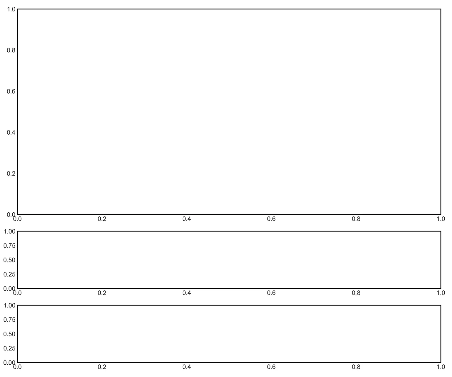
Set the overall shape and size of the chart.
Code
import matplotlib.pyplot as plt
import mplfinance as mpf

# Setting the overall size of the graph
fig = mpf.figure(figsize=(12,10))

# Creating subplots for the main chart, MACD chart, and MACD oscillator chart
ax_main = fig.add_subplot(5, 1, (1, 3), facecolor='white') # Main chart
ax_macd = fig.add_subplot(5, 1, (4, 4), facecolor='white') # MACD chart
ax_hist = fig.add_subplot(5, 1, (5, 5), facecolor='white') # MACD oscillator chart

# Adjusting the spacing between subplots
fig.tight_layout()
Explanation
Setting the Overall Graph Size: Determine the overall graph size to be 12 inches in width and 10 inches in height using
mpf.figure(figsize=(12,10)). This size defines the entire graph window.Creating Subplots: Subplots define the position and size of individual charts within the entire graph window.
- Main Chart:
fig.add_subplot(5, 1, (1, 3), facecolor='white')divides the entire graph vertically into 5 parts and horizontally into 1, allocating the first 3 vertical sections to the main chart. - MACD Chart:
fig.add_subplot(5, 1, (4, 4), facecolor='white')assigns the fourth vertical section to the MACD chart. - MACD Oscillator Chart:
fig.add_subplot(5, 1, (5, 5), facecolor='white')assigns the last vertical section to the MACD oscillator chart.
- Main Chart:
Spacing Adjustment:
fig.tight_layout()is used to adjust the spacing between subplots, ensuring the graph is uniformly arranged for an aesthetically pleasing layout.
Creating the Main Chart (Candlestick Chart and Moving Averages)
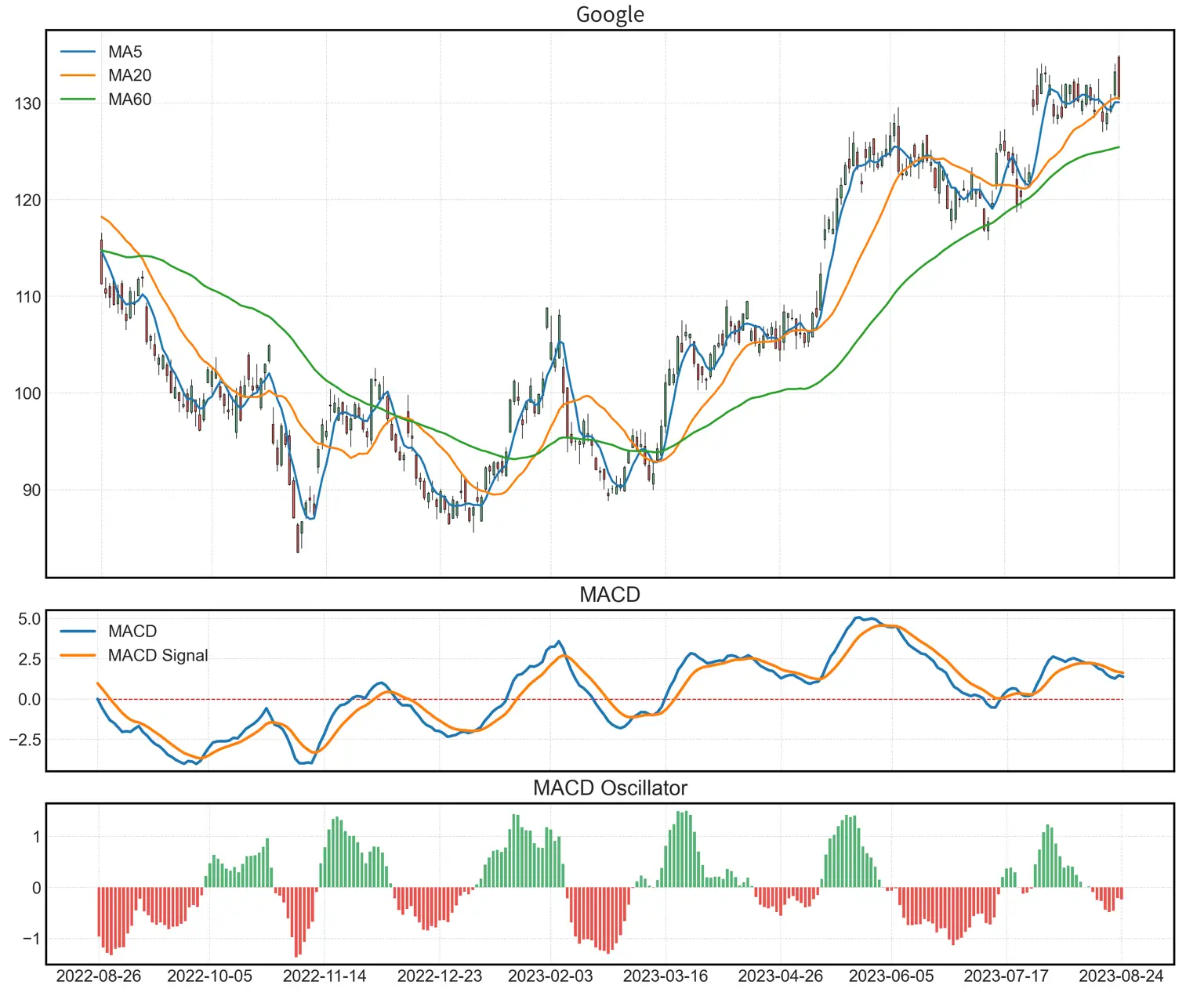
The candlestick chart serves as a vital instrument in analyzing stock market trends. It graphically represents the opening, closing, highest, and lowest prices, while moving averages delineate the stock's average price over a defined period. Utilizing the TA-Lib library simplifies the execution of such analysis.
Code
added_plots = {
    'MA5': mpf.make_addplot(data.sma5, type='line', ax=ax_main, width=1.5),
    'MA20': mpf.make_addplot(data.sma20, type='line', ax=ax_main, width=1.5),
    'MA60': mpf.make_addplot(data.sma60, type='line', ax=ax_main, width=1.5),
}

mc = mpf.make_marketcolors(up="#56B476", down="#E9544F", edge='black')

s = mpf.make_mpf_style(marketcolors=mc, gridcolor='#DDDDDD', gridstyle="--")

mpf.plot(data,
         style=s,
         type='candle',
         ax=ax_main,
         addplot=list(added_plots.values()),
         datetime_format='%Y-%m-%d',
         returnfig=True)

ax_main.set_ylabel('')
Explanation
Setting Moving Averages Plot: Using the
mpf.make_addplotfunction, 5-day, 20-day, and 60-day moving averages are drawn as line graphs, whereax=ax_mainsignifies plotting the moving averages on the main chart.Configuring Market Colors: The
mpf.make_marketcolorsfunction sets the colors for the candlestick chart's upward and downward trends. In this instance, green (#56B476) denotes an increase, and red (#E9544F) signifies a decrease.Styling: The
mpf.make_mpf_stylefunction configures the overall aesthetic of the graph, specifying market colors, grid colors, and grid style.Drawing the Candlestick Chart: The
mpf.plotfunction is employed to render the candlestick chart along with the previously established moving averages. Here, theaddplotargument adds the moving average plots, and thedatetime_formatdetermines the date format.Y-Axis Label Configuration:
ax_main.set_ylabel('')removes the Y-axis label.
This code demonstrates the process of drawing Google's stock candlestick chart and moving averages using the mplfinance library. This library offers the advantage of drawing candlestick charts and moving averages with ease and utilizing built-in styles.
Detailed instructions are available in [Python] Drawing Candlestick Charts with mplfinance on how to use the mplfinance library to draw a candlestick chart.
Illustrating MACD Indicator and MACD Oscillator Histogram
The MACD indicator represents the disparity between two moving averages, a difference that plays a crucial role in discerning the strength and direction of the trend. The MACD oscillator histogram visually assists in analysis by depicting this difference in bar graph form.
Code
ax_macd.plot([0, len(index)-1],
                 [0, 0],
                 color='#DE0000',
                 linestyle='--',
                 linewidth=0.7)

ax_macd.plot(data.index,
                data['macd'],
                label='MACD')

ax_macd.plot(data.index,
                data['macd_signal'],
                label='MACD Signal')

histogram = data['macd_hist']
index = data.index.strftime('%Y-%m-%d')
ax_hist.bar(list(index), list(histogram.where(histogram > 0)), 0.7, color="#56B476")
ax_hist.bar(list(index), list(histogram.where(histogram < 0)), 0.7, color="#E9544F")
Explanation
Drawing the Central Line: The central line is drawn on the MACD chart. This line serves as the baseline to judge whether the MACD value is positive or negative. It is displayed as a red dashed line (
#DE0000).Plotting MACD and MACD Signal: The
ax_macd.plotfunction is utilized to render the MACD values and MACD Signal values as line graphs.Illustrating MACD Histogram: The
ax_hist.barfunction draws the MACD histogram, determining positive and negative values, and marking them in green (#56B476) and red (#E9544F), respectively.
- Converting Index Strings: The primary reason for converting the index to a string when drawing a bar chart is to overcome issues when handling consecutive weekdays, such as in stock data. Typically, passing the x-axis in datetime format replaces non-existent dates (e.g., weekends) with a zero value. This method may be inappropriate for scenarios like the stock market, where data only exists on specific dates. Therefore, by converting the index to a 'year-month-day' string, the continuous display of dates is avoided, preventing the representation of dates with no data. The
strftime('%Y-%m-%d')function converts the date index to the corresponding string format.
Setting Chart Titles, Legends, Scale, and Rendering the Chart
In this section, the final steps required to complete the chart are carried out. Titles are added to clarify the theme of the chart, and legends are utilized to elucidate each part of the chart. Scale settings designate the units of the axes, and upon completing all settings, the chart is rendered.
Code
# Setting the title for each chart
ax_main.set_title('Google', fontsize=15)
ax_macd.set_title('MACD', fontsize=15)
ax_hist.set_title('MACD Oscillator', fontsize=15)

# Setting the legend for the main chart
font = font_manager.FontProperties(weight='normal')
ax_main.legend([None] *(len(added_plots)+2))
handles = ax_main.get_legend().legend_handles
ax_main.legend(handles=handles[2:], labels=list(added_plots.keys()), prop=font)

# Setting the legend for the MACD chart
ax_macd.legend(loc=2, prop=font)

# Setting x-axis tick marks
step = (len(data) - 1) / (tick_count - 1)
ticks = [0 + int(step * i) for i in range(tick_count)]
ax_main.xaxis.set_ticks(ticks)
ax_macd.xaxis.set_ticks(ticks)
ax_hist.xaxis.set_ticks(ticks)
ax_main.xaxis.set_ticklabels([])
ax_macd.xaxis.set_ticklabels([])

# Configuring the grid
ax_main.grid(color='#dddddd', linestyle='--', linewidth=0.5)
ax_macd.grid(color='#dddddd', linestyle='--', linewidth=0.5)
ax_hist.grid(color='#dddddd', linestyle='--', linewidth=0.5)

# Displaying the graph
plt.show()
Description
Setting Chart Titles: The title of each chart is configured using
ax_main.set_title,ax_macd.set_title,ax_hist.set_title, passing the title string and font size as parameters.Configuring the Main Chart's Legend: The legend of the moving averages for the main chart is set. As charts drawn with
mplfinancedon't directly allow for legends, a multi-step procedure is used to append the legend. An empty legend is first created throughax_main.legend([None]*(len(added_plots)+2)), then actual legend handles are acquired withhandlesto set the legend.Configuring the MACD Chart's Legend: A legend is added to the MACD chart. Location and font properties can be specified.
Setting x-axis Tick Marks: Using the
tick_countvariable, the number of tick marks to be displayed on the x-axis is calculated and set. The positioning of each tick mark is uniformly distributed based on the total data length and the count of tick marks.Grid Configuration: The style and color of the grid for each chart are defined, enhancing the chart's readability.
Displaying the Graph: The graph is rendered on screen by invoking
plt.show().
The configuration of the main chart's legend necessitates a complex procedure due to specific behavior within the mplfinance library. Accurate understanding and implementation of this part are vital.
FAQs
Is the process of fetching data using
yahooquerycomplex?- No,
yahooquerygreatly simplifies the task of retrieving data from Yahoo Finance. It allows for easy acquisition of specific stock data for a specified period, enabling immediate utilization of the desired data without intricate configuration. Detailed information can be found at [Python] Yahooquery: Retrieving and Managing Past Stock and Financial Data.
- No,
How can the moving averages be drawn using TA-Lib?
- TA-Lib is a powerful library capable of calculating various technical indicators. Drawing moving averages can be accomplished with just a few lines of code, allowing you to specify the type and period of the moving averages you want. More details can be found at [TA-Lib] #4: Moving Average Analysis - Golden & Dead Cross.
Why is the MACD indicator important, and how is it used?
- The MACD indicator serves as a crucial tool for assessing the strength and direction of a trend. By evaluating the difference between two moving averages, it appraises the market momentum and aids in investment decision-making. Using TA-Lib, you can easily compute and analyze the MACD indicator. Comprehensive analysis methods can be found at [TA-Lib] #6: Analyzing and Calculating MACD with TA-Lib.
Why are the chart's legend and tick mark settings important?
- Legends and tick marks play a vital role in reading and comprehending a chart. Legends describe what various lines and colors represent, while tick marks provide the precise values and units for the chart's axes. These elements enhance the chart's readability and assist users in more easily and accurately identifying crucial information from the chart.
What programming knowledge is required for this project?
- To undertake this project, you'll need a fundamental understanding of Python programming and data visualization. Using libraries such as
yahooqueryand TA-Lib can greatly simplify complex computations and visualizations, thus intricate mathematical knowledge is not essential. Details about the specific libraries and modules can be referenced in the aforementioned links.
- To undertake this project, you'll need a fundamental understanding of Python programming and data visualization. Using libraries such as